Preferred interface language
You can choose your preferred language for this page with the first row of buttons.
That will also set the language for the interface, i.e. the legends on buttons and the text of messages.
Text Size
Depending on the display you are using and on your eyesight, you may want text to be small or large. Note that choosing larger text will not oblige you to scroll horizontally: all pages reflow their text to adapt to the width of your screen (but see chapter on handhelds & tablets).
To enlarge or reduce the size of text over the entire site, use the buttons on the first row of the second preferences line.
Letter Spacing
The space between letters of a text can make it more or less comfortable to read. By default this site uses a smaller distance ("condensed" font face). A normal spacing or a different spacing can be set with the buttons on the second row of the second line.
Chapter Folding on First Visit
Chapters show little triangles like ▶ and ▼ in front of their title text (on most pages). These can be used to “fold up” or again “unfold” an individual chapter’s content, making it easier to find your way around long pages, especially on mobile devices.
Pages also show a larger triangle at the top left with which you can fold/unfold all chapters at once. That gives a choice between these two presentations:

|
|
When you visit a certain page for the very first time you may want all chapters to be unfolded already if you are using a large screen with a desktop or laptop computer. However on tablets and smartphones it can be useful to get all chapters already folded, and unfold only those that you wish to read.
Choose whether you want pages to load the first time with their chapters folded or unfolded with the buttons on the third preferences line.
Note that for each page your device's browser will remember which chapters you unfolded, and on the next visit to that page it will present them in the way you set them last. If you want to fold or unfold all chapters at once, use the large triangle at the top.
Overflowing Elements
Some elements such as wide tables may not fit entirely in the window of the browser, possibly because the device's screen is too narrow for the chosen text size.
In this case you will have to scroll the element horizontally to see more of it. However, some browsers on some devices refuse to show scrollbars around such elements and hence you may not notice that a part is hidden on the right.
You may choose to have a special border drawn around such elements by using the buttons on the fourth preferences line.
Here is an example:
xxxxxxxxxxxxxxxxxxxxxxxxxxxxxxxxxxxxxxxxxxxxxxxxxxxxxxxxxxxxxxxxxxxxxxxxxxxxxxxxxxxxxxxxxxxxxxxxxxxxxxxxxxxxxxxxxxxxxxxxxxxx
Text Styling
Text styling is used in these ways:
- emphasis
- there are emphasised phrases which are important and should stand out visually,
- intonate
- there are intonated phrases which are read with more stress, usually to lift possible ambiguities while reading, but they do not have to stand out visually,
- quote
- for short citations quoted phrases are used,
- definition
- definitions of terms where they occur the first time,
- term
- subsequent uses of terms after they are defined and when it is useful to remind the reader that there is a defined precise meaning,
- math
- mathematical formulae like y=ax2+bx+c,
- code
- pieces of typed computer code,
- hyperlink
- the usual link that can be clicked to go to another location.
Handling SVGs
In this site drawings are in SVG (Scaleable Vector Graphics) format. On devices with a keyboard an mouse they can be zoomed and panned (on mobile devices this is limited!). This is sometimes useful for looking at a detail. Here is an example:
To move the drawing around in its frame (pan), just drag it.
To zoom, hold down the option key (“ALT” key) and drag left (zoom out) or right (zoom in).
To set the view back to its original position and scale, hold down the shift key and click in the drawing.
Alternatively, a drawing may already be presented at a large scale, but inside a frame with scrollbars. Here is an example:
scales with window width (60%, 35%). [SVG]
On some tablet browsers the scrollbars may not be visible.
SVG drawings that can be manipulated are distinguished from other graphics by a little red “[SVG]” mark at the end of their figure caption; it is a link back to these instructions.
All SVG drawings are mine; they contain no copyrighted material. You may re-use them provided you mention this site as their origin. To re-use, you can extract the SVG code from the page source.
Pedantic stuff
General approach
The primary objective of the site’s styling is to make it easy to read.
The site adapts to the size of the display. You should never have to scroll horizontally, and on smartphones and tablets you should not have to use gestures like pinch-zoom to enlarge or reduce the content. However, some elements may appear in a scrollable box because fitting them into the width of the display would make them unreadably small. The notable case is a table with many columns; see about overflowing elements in chapter .
Should you find some aspects of the appearance strange, then maybe there is an explanation to be found in the chapters below.
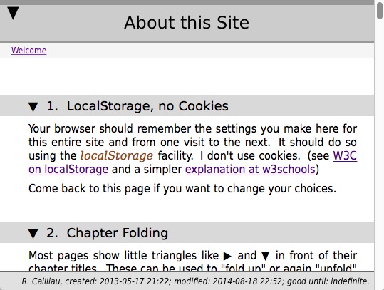
LocalStorage, no Cookies
Your browser will be using the localStorage facility to remember your settings. I don’t use cookies. See W3C on localStorage and a simpler explanation at w3schools.
Nothing about you or your reading of the site is stored on the server (exception made for parts of sites where access is restricted to registered members of an association).
Smartphones and Tablets
There is a trend to allow “designers” all control over the appearance of a site. Readability is then being relegated to some sort of “accessibility” mode.
At the time of writing this (2018-10) the behaviour of browsers on smartphones and tablets is completely defective for the purposes of comfortable reading. Especially difficult or impossible is changing the browser’s default text size on a mobile device. For example, on iPads Safari does not let you decide; you may wish to try a different browser. I simply refuse to set cookies on your device and/or script the text size with superfluous “A A A” buttons. However you can use the text size buttons above, and your browser should remember the setting.
Summary
To summarise:
- The primary objective is to make reading comfortable.
- I use the DejaVu font. Your browser, if it is able to do so, will download them as needed. You can inspect the licence.
- If your browser cannot handle fonts, then:
- Your browser’s fonts will be used.
- The serif font will be shown at the same size as the sans-serif and will therefore probably appear too small.
- Mobile device browsers may not allow you to set the text size at all; use the buttons on this page.
- Drawings in SVG and some other features may not behave as expected on mobile devices.
Happy reading…
Technical Notes
This is a “static” site, in the sense that I do not use a content management system or generate the pages from a data base or by scripts.
I try to use simple HTML, laid out with CSS formatting throughout.
Images are in jpeg or png format and drawings and graphs are in SVG format.
Rendering is in relative measures, based on your chosen text size. The dimensions of elements that scale with the text are specified in em units; other sizes are specified as a percentage of the width of the browser’s window. No sizes are specified using pixels as a unit. If things appear too small or too large, it’s the fault of your browser and/or its settings: choose a good browser, choose a good base font size in your browser’s preferences, use the text size buttons above.
Using relative sizes has many advantages, but there are a number of problems too. The most noticeable is the result of a typographic problem that cannot be remedied elegantly.
I use three different font classes:
- sans-serif for the main text (such as this list);
- monospace for program code, mathematics, typed input;
- serif for quotes, emphasis and a few other cases.
Unfortunately, the actual sizes of lower case characters in those three classes are not the same, even if their size specifications look the same. You can read more in Typography and the Web.
To my knowledge there are only three ways out if this problem:
- set the three sizes correctly in the browser preferences, if that is possible;
- force absolute sizes and use specific fonts;
- find a font that has the lower case sizes the same for all three classes.
Solution 2 would imply the use of CSS specifications of the kind:
font-family: “DejaVu”; font-size: 12pt;
Your ability to make text bigger or smaller to suit your eyes’ needs would then be compromised.
Solution 1 should be the preferred one, since in theory it allows you to specify how you want to see all sites presented (i.e. large type or small type, according to your visual acuity).
Most browsers do allow you to set a default font size somewhere in the browser’s preferences. Unfortunately in many browsers the size choice is limited to a single number that is applied to all font classes. Thus the serif font will most often appear somewhat smaller than the sans-serif, no matter what you choose (unless perhaps the font family includes both serif and sans-serif).
Here is a paragraph in which a mix of the three classes of fonts occurs, where all sizes are 1.0em and where all fonts are generic (i.e. decided by your browser):
this text is in 1.0em sans-serif normal font; this is 1.0em serif font; this is 1.0em monospaced font.
Here is the same paragraph but now with the generic serif font 20% larger and the monospace 40% larger:
this text is in 1.0em sans-serif normal font; this is 1.2em serif font; this is 1.4em monospaced font.
If I leave it to your browser you will have problems; if I try to guess at the relative sizes you will have problems too, and I will have to introduce a lot of silly code. The solution is to get serif, sans-serif and monospace fonts that are compatible with each other and transmit those to your browser.
The font DejaVu does have such serif, sans-serif and monospace faces, and to date (2018-12-28 16:39) it is the only one I found that does so and therefore will act reasonably. Here is the same paragraph with “DejaVu”, all classes with the same size specification:
this text is in 1.0em sans-serif normal font; this is 1.0em serif font; this is 1.0em monospaced font.
This seems to work fine. But as you can see from the examples, typographers have a serious problem with character sizes.
Most commercial sites solve the problem by completely ignoring the browser and the reader, forcing the site designer’s choices in absolute terms.